Pmw.ScrolledText

Name

Pmw.ScrolledText() - text widget with optional scrollbars

Inherits

Pmw.MegaWidget

Description

A scrolled text consists of a standard text widget with optional scrollbars which can be used to scroll the text. The scrollbars can be dynamic, which means that a scrollbar will only be displayed if it is necessary. That is, if the text widget does not contain enough text (either horizontally or vertically), the scrollbar will be automatically hidden. If it is displayed, the horizontal scrollbar is under the text widget. Similarly, if it is displayed, the vertical scrollbar is to the right of the text widget.

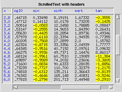
Row and column headers may also be displayed, which scroll in sync with the text widget and may be useful when displaying tabular data. To assist in ensuring that columns line up when using a column header, a fixed width font should be used.

Options

Options for this megawidget and its base classes are described below.

borderframe
Initialisation option. If true, the borderframe component will be created. The default is 0.

columnheader
Initialisation option. If true, the columnheader component will be created. The default is 0.

hscrollmode
The horizontal scroll mode. If 'none', the horizontal scrollbar will never be displayed. If 'static', the scrollbar will always be displayed. If 'dynamic', the scrollbar will be displayed only if necessary. The default is 'dynamic'.

labelmargin
Initialisation option. If the labelpos option is not None, this specifies the distance between the label component and the rest of the megawidget. The default is 0.

labelpos
Initialisation option. Specifies where to place the label component. If not None, it should be a concatenation of one or two of the letters 'n', 's', 'e' and 'w'. The first letter specifies on which side of the megawidget to place the label. If a second letter is specified, it indicates where on that side to place the label. For example, if labelpos is 'w', the label is placed in the center of the left hand side; if it is 'wn', the label is placed at the top of the left hand side; if it is 'ws', the label is placed at the bottom of the left hand side.

If None, a label component is not created. The default is None.

rowcolumnheader
Initialisation option. If true, the rowcolumnheader component will be created. The default is 0.

rowheader
Initialisation option. If true, the rowheader component will be created. The default is 0.

scrollmargin
Initialisation option. The distance between the scrollbars and the text widget. The default is 2.

usehullsize
Initialisation option. If true, the size of the megawidget is determined solely by the width and height options of the hull component.

Otherwise, the size of the megawidget is determined by the width and height of the text component, along with the size and/or existence of the other components, such as the label, the scrollbars and the scrollmargin option. All these affect the overall size of the megawidget. The default is 0.

vscrollmode
The vertical scroll mode. If 'none', the vertical scrollbar will never be displayed. If 'static', the scrollbar will always be displayed. If 'dynamic', the scrollbar will be displayed only if necessary. The default is 'dynamic'.

Components

Components created by this megawidget and its base classes are described below.

borderframe
A frame widget which snuggly fits around the text widget, to give the appearance of a text border. It is created with a border so that the text widget, which is created without a border, looks like it has a border. By default, this component is a Tkinter.Frame.

columnheader
A text widget with a default height of 1 displayed above the main text widget and which scrolls horizontally in sync with the horizontal scrolling of the main text widget. By default, this component is a Tkinter.Text. Its component group is Header.

horizscrollbar
The horizontal scrollbar. By default, this component is a Tkinter.Scrollbar. Its component group is Scrollbar.

hull
This acts as the body for the entire megawidget. Other components are created as children of the hull to further specialise this class. By default, this component is a Tkinter.Frame.

label
If the labelpos option is not None, this component is created as a text label for the megawidget. See the labelpos option for details. Note that to set, for example, the text option of the label, you need to use the label_text component option. By default, this component is a Tkinter.Label.

rowcolumnheader
A text widget displayed to the top left of the main text widget, above the row header and to the left of the column header if they exist. The widget is not scrolled automatically. By default, this component is a Tkinter.Text. Its component group is Header.

rowheader
A text widget displayed to the left of the main text widget and which scrolls vertically in sync with the vertical scrolling of the main text widget. By default, this component is a Tkinter.Text. Its component group is Header.

text
The text widget which is scrolled by the scrollbars. If the borderframe option is true, this is created with a borderwidth of 0 to overcome a known problem with text widgets: if a widget inside a text widget extends across one of the edges of the text widget, then the widget obscures the border of the text widget. Therefore, if the text widget has no border, then this overlapping does not occur. By default, this component is a Tkinter.Text.

vertscrollbar
The vertical scrollbar. By default, this component is a Tkinter.Scrollbar. Its component group is Scrollbar.

Methods

Only methods specific to this megawidget are described below. For a description of its inherited methods, see the manual for its base class Pmw.MegaWidget. In addition, methods from the Tkinter.Text class are forwarded by this megawidget to the text component.

appendtext(text)
Add text to the end of the text component. Scroll to the bottom of the text, but only if it was already visible before the new text was added.

bbox(index)
This method is explicitly forwarded to the text component's bbox() method. Without this explicit forwarding, the bbox() method (aliased to grid_bbox()) of the hull would be invoked, which is probably not what the programmer intended.

clear()
Delete all text from the text component.

exportfile(fileName)
Write the contents of the text component to the file fileName.

get(first = None, last = None)
This is the same as the get() method of the text component, except that if first is None the entire contents of the text widget are returned.

getvalue()
Return the entire contents of the text widget.

importfile(fileName, where = 'end')
Read the contents of the file fileName and insert into the text component at the position given by where.

settext(text)
Same as setvalue() method.

setvalue(text)
Replace the entire contents of the text component with text.

Example

The image at the top of this manual is a snapshot of the window (or part of the window) produced by the following code.

class Demo:
    def __init__(self, parent):

        # Create the ScrolledText with headers.
        fixedFont = Pmw.logicalfont('Fixed')
        self.st = Pmw.ScrolledText(parent,
                # borderframe = 1,
                labelpos = 'n',
                label_text='ScrolledText with headers',
                columnheader = 1,
                rowheader = 1,
                rowcolumnheader = 1,
                usehullsize = 1,
                hull_width = 400,
                hull_height = 300,
                text_wrap='none',
                text_font = fixedFont,
                Header_font = fixedFont,
                Header_foreground = 'blue',
                rowheader_width = 3,
                rowcolumnheader_width = 3,
                text_padx = 4,
                text_pady = 4,
                Header_padx = 4,
                rowheader_pady = 4,
        )

        self.st.pack(padx = 5, pady = 5, fill = 'both', expand = 1)

        funcs = 'atan cos cosh exp log log10 sin sinh sqrt tan tanh'
        funcs = string.split(funcs)

        # Create the header for the row headers
        self.st.component('rowcolumnheader').insert('end', 'x')

        # Create the column headers
        headerLine = ''
        for column in range(len(funcs)):
            headerLine = headerLine + ('%-7s   ' % (funcs[column],))
        headerLine = headerLine[:-3]
        self.st.component('columnheader').insert('0.0', headerLine)

        self.st.tag_configure('yellow', background = 'yellow')

        # Create the data rows and the row headers
        numRows = 50
        tagList = []
        for row in range(1, numRows):
            dataLine = ''
            x = row / 5.0
            for column in range(len(funcs)):
                value = eval('math.' + funcs[column] + '(' + str(x) + ')')
                data = str(value)[:7]
                if value < 0:
                    tag1 = '%d.%d' % (row, len(dataLine))
                    tag2 = '%d.%d' % (row, len(dataLine) + len(data))
                    tagList.append(tag1)
                    tagList.append(tag2)
                data = '%-7s' % (data,)
                dataLine = dataLine + data + '   '
            dataLine = dataLine[:-3]
            header = '%.1f' % (x,)
            if row < numRows - 1:
                dataLine = dataLine + '\n'
                header = header + '\n'
            self.st.insert('end', dataLine)
            self.st.component('rowheader').insert('end', header)
        apply(self.st.tag_add, ('yellow',) + tuple(tagList))

        # Prevent users' modifying text and headers
        self.st.configure(
            text_state = 'disabled',
            Header_state = 'disabled',
        )

Pmw 1.3 - 6 Aug 2007 - Home
Manual page last reviewed: 30 August 1998